A bold visual identity for a modern music record label built around growth, momentum, and creative ambition.
LVL UP RCRDS is a conceptual brand identity project created by The Glacian Studio for a modern record label. The project explores how a record label can look modern, sharp, and instantly recognizable while still feeling flexible enough for digital platforms, artist campaigns, merchandise, and music releases.
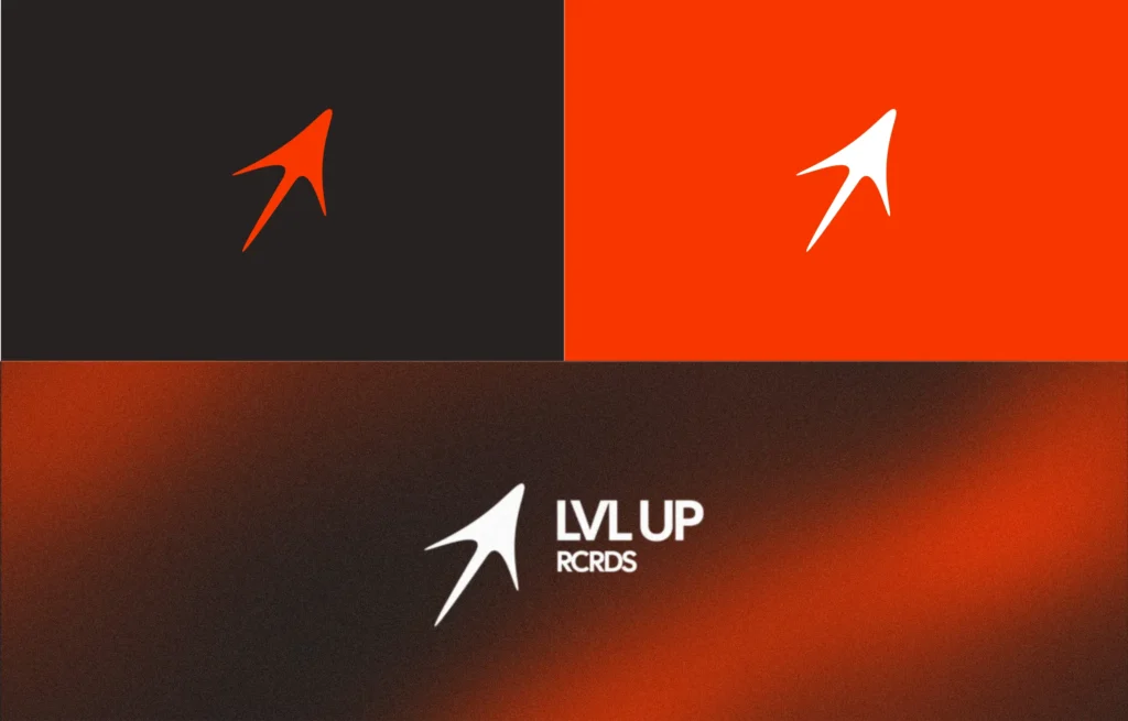
The identity is built around a custom upward-moving symbol that represents progress, direction, and the idea of leveling up. Paired with a strong orange, black, and white color system, the brand feels confident, energetic, and ready for a digital-first music audience.
Project Overview
LVL UP RCRDS was created as a visual identity system for a new-age music record label. The goal was to build a brand that could stand out across streaming platforms, social media, posters, artist drops, merchandise, and web experiences.
Instead of creating only a logo, the project focuses on building a complete visual direction. This includes the main logo mark, logo variations, brand colors, typography choices, and mockup applications that show how the identity can work in real use.
The final direction gives the brand a clean but bold personality. It feels modern, fast, and expressive without becoming complicated.
The Challenge
Music brands need to be memorable within seconds. Whether someone sees the logo on a Spotify cover, YouTube thumbnail, Instagram post, hoodie, or website banner, the identity has to be simple enough to recognize quickly.
The main challenge was to create a logo and visual system that felt energetic and premium, while still being minimal and easy to apply across different formats.
The brand also needed to avoid looking too generic. Many music label identities use common symbols, basic typography, or overly complex graphics. LVL UP RCRDS needed something sharper, cleaner, and more distinctive.
The Solution
We created a custom directional logo mark inspired by upward movement, progress, and creative ambition. The shape feels fast, bold, and slightly abstract, making it suitable for a modern music label.
The logo works well as a standalone icon, but it also pairs naturally with the LVL UP RCRDS wordmark. This makes the identity flexible for different placements such as social media profile pictures, merchandise, posters, album artwork, and website sections.
The orange color gives the brand energy and attention, while the black and white system keeps it grounded and premium. Together, the color palette creates strong contrast and makes the brand easy to recognize across both dark and light backgrounds.
Typography was kept clean, bold, and digital-friendly so that the overall identity feels modern without taking attention away from the symbol.
Visual Identity Direction
The LVL UP RCRDS identity was designed to feel:
Bold — strong shapes, high contrast, and confident use of color.
Energetic — a visual language inspired by movement, speed, and progress.
Minimal — simple enough to work across small and large formats.
Flexible — suitable for music releases, merchandise, social media, and digital campaigns.
Modern — clean typography and a digital-first presentation style.
The visual system includes logo variations on light, dark, and orange backgrounds, allowing the brand to stay consistent in different environments.
Brand Applications
To show how the identity works beyond the logo, the brand was applied to real-world mockups and digital-style visuals.
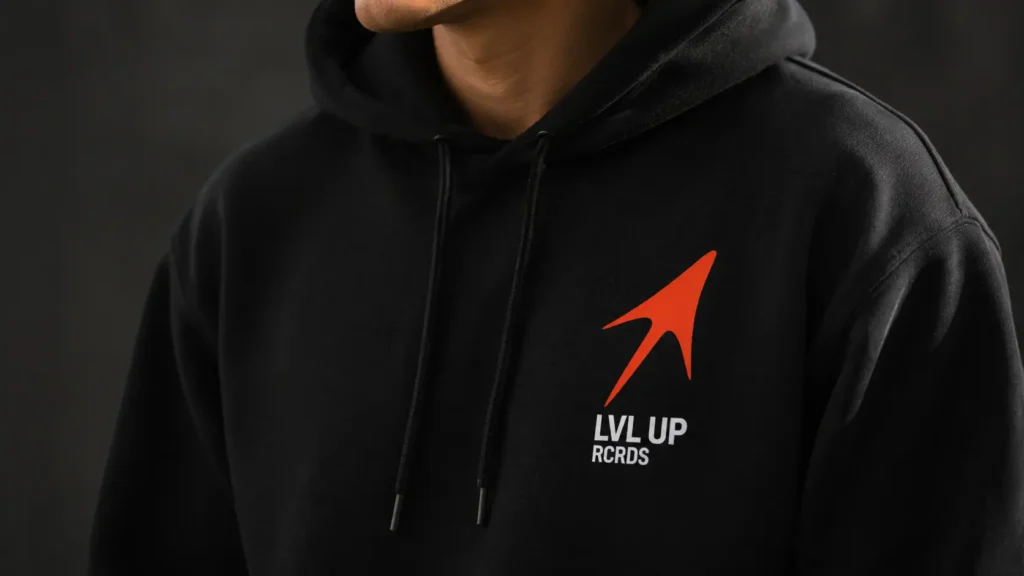
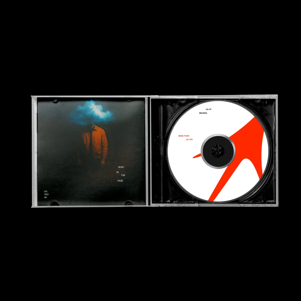
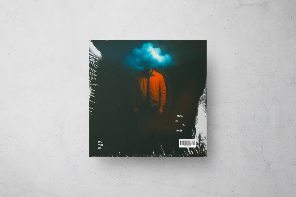
The hoodie mockup shows how the mark can work as merchandise for artists, fans, or label campaigns. The album cover mockup gives the identity a more music-focused application, showing how the brand can exist within release artwork or promotional visuals.
These applications help turn the identity from a static logo into a usable brand system.
Result
The final identity gives LVL UP RCRDS a strong and memorable visual foundation. It feels bold, modern, and flexible while staying simple enough to scale across multiple platforms.
The project shows how a music label can build a recognizable visual presence through a strong symbol, clean typography, and a focused color system.
LVL UP RCRDS is not just a logo design project. It is a complete brand identity direction built for digital use, music culture, merchandise, and future creative expansion.